Instorm is a perfect magazine and blog theme with a colorful gradient style. Give it your own style by setting it to any color you want.
Theme Features
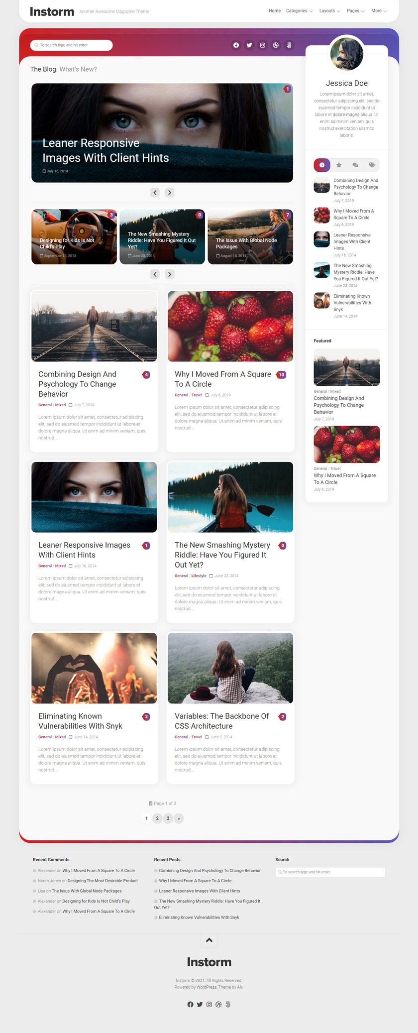
Colorful design
Set the background and gradient colors as desired, it looks good!
Unique social bar
Share your social links in the colorful bar on the left.
Ultra Responsive
The theme scales beautifully from full HD resolution to low resolution phones.
100% high resolution
Exceptional clarity on retina screens and other high-resolution devices. Never compromise.
Article formats
Easily display video, audio, image and gallery sliders using the most commonly used article formats.
0-4 Footer Widget Columns
0-4 column footer widget area, with a personal favorite of 3 columns to allow plenty of space on all devices.
Back-end theme options
Provide powerful customization features directly from the theme options panel without touching any code at all.
Set maximum site width
You can choose how wide you want your site to be from the admin panel. Using a simple numeric slider, it’s just one click away.
Custom Logo Upload
Upload your own custom logo in just a few clicks. Don’t have a logo yet? Use the standard plain text option.
Gutenberg Support
This theme is flexible and fully supports Gutenberg blocks.
Unlimited widget areas
There is no limit to how many widget sidebars you can create. Each widget area can be assigned to a unique page, post or standard WP section.
Concise Code
Easy to use WordPress theme code structure. No bloated code layers
Automatic updates in the dashboard
When a theme update is available, it’s just a click away in the WordPress dashboard. The theme stays up-to-date.
Block Support
This theme is flexible and fully supports alignwide and alignfull Gutenberg blocks.
Related posts and navigation
Spark your readers’ interest to browse more articles on your site with related articles and links to previous and next articles.
Almost Zero Images
With Font Awesome, CSS and a modern flat look, this theme manages to load only a small number of images in total for the entire layout based on the layout selection.
Search Engine Optimized
The markup is search engine optimized to provide the best results for your website.
Localization support
Use the included .po / .mo files to translate it into any language you want.
Multiple style options
Set any unrestricted accent color for themes and other specified areas in seconds.
Flexible layout options
Set sidebars on the left or right side of any post or page. You can also specify 404 pages for home pages, individual pages, archive pages, category pages, search pages and error pages.
Custom Page Templates
Includes page templates such as sub-page menus. Layout options are numerous.
Custom widgets
Includes widgets for displaying responsive videos, tabbed content, article lists and other clean features.
Cross-Browser Support
Compatible with the latest versions of modern browsers – Firefox, Chrome, Safari, Opera and IE.
Comprehensive sub-theme support
The theme is built with sub-themes in mind. All features and files are pluggable and easy to use.
Real-time customizer
All theme options have been changed from the WordPress live customizer, so you can easily see the changes made.
Kirki Customizer Framework
All options in the Live Customizer are built using the Kirki Theme Options Customizer framework.
Theme Preview
Download
- Official Introduction: https://alx.media/themes/instorm/
- Online Demo: http://demo.alx.media/instorm/
- Theme Download: https://wordpress.org/themes/instorm/